编者按:这是一篇由 Dhruv Ateja 撰写的客座博文。文章介绍了如何构建一个全栈应用程序,该程序使用 Agent 来查询数据并选择如何展示数据。它利用了 LangGraph 和 LangGraph Cloud。
重要链接
让我们来探索一个令人兴奋的项目,该项目利用 LangGraph Cloud 的流式 API 来创建一个数据可视化 Agent。您可以上传 SQLite 数据库或 CSV 文件,提出关于您数据的问题,Agent 将生成适当的可视化图表。这篇博文简要介绍了 Agent 的工作流程和主要功能。
整个工作流程都由 LangGraph Cloud 编排,它提供了一个框架,可以轻松构建复杂的 AI Agent,提供用于实时更新的流式 API,以及用于监控和实验 Agent 行为的可视化工作室。
首先,让我们看看当前最先进的文本到 SQL 工作流程
模式和元数据提取
- 系统处理提供的数据库(例如,SQLite 或 CSV)以提取关键信息,如表结构和列详细信息。
- 这个初始步骤提供了对数据库组织的全面理解。
嵌入创建
- 对于较大的数据集,会生成模式元素(表、列)和示例数据的嵌入。这些嵌入提高了后续检索和匹配任务的效率。
实体和上下文检索
- 分析用户的查询以识别实体和整体上下文。
- 对于数据库值,可以实现利用局部敏感哈希(LSH)索引的句法搜索。
使用检索增强生成(RAG)的相关表提取
- 此步骤利用 RAG 来精确定位包含用户所寻求信息的相关表。
- 实验性方法
- 如果模式在上下文窗口内是可管理的,则可以跳过此步骤。
- 探索基于知识图谱的 RAG 以实现多跳功能是未来发展的潜在途径。
- 提取相关列可以馈送到 RAG 中,以实现更精确的表提取。
大型模式处理
- 当处理海量表模式时,可以采用技术来有效地管理它们
- 将模式详细信息减少到必要信息可确保高效处理。
- 基于元数据标签修剪列可以简化分析。
- 然后可以将修剪后的模式呈现给语言模型(LLM),以评估表的关联性。
表和关联性验证
- 仔细验证提取的表,以确保它们与用户的查询真正相关。
SQL 查询生成
- 将相关表、它们的模式和示例数据行馈送到 LLM 中,以生成 SQL 查询。
- 实验: 提示 LLM 评估过滤后的表中每列的必要性,并结合链式思考解释,可以为生成的查询背后的推理提供有价值的见解。
查询结构验证
- 工作流程验证并纠正生成的 SQL 查询的结构,确保其在执行前的正确性。
对于我们的项目,我们专注于较小的数据集,消除了对 RAG 或 LSH 技术的需求。但是,核心工作流程保持一致。要探索针对较大数据集的文本到 SQL 实现,请查看 Pinterest Engineering 的这篇富有洞察力的文章。
以下是文本到 SQL 工作流程实现的概述
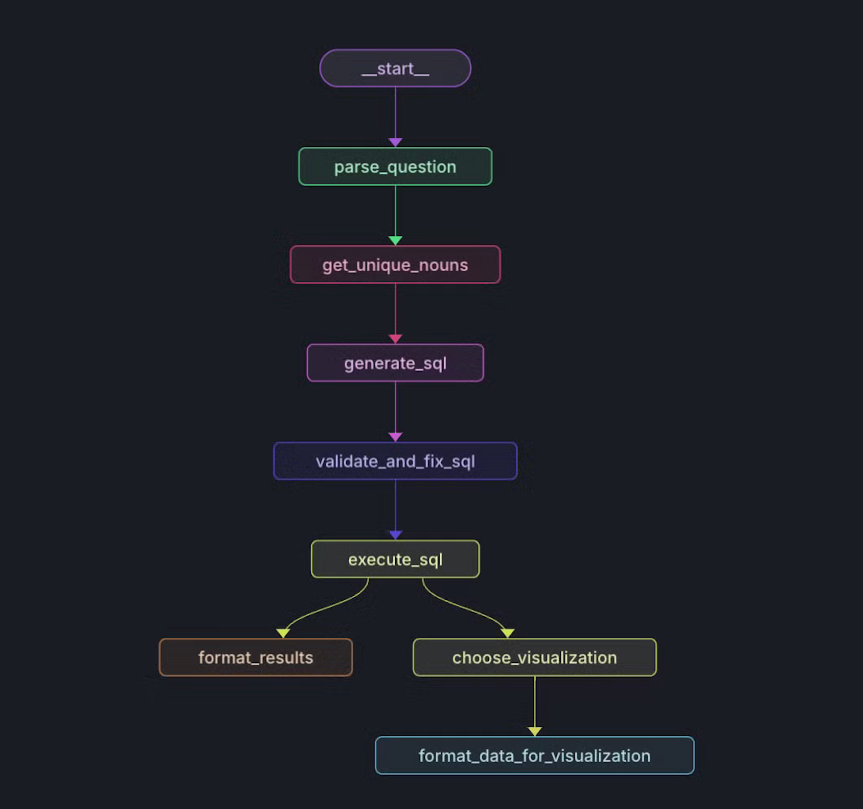
设置图
    def create_workflow(self) -> StateGraph:
        """Create and configure the workflow graph."""
        workflow = StateGraph(State)
        # Add nodes to the graph
        workflow.add_node("parse_question", self.sql_agent.parse_question)
        workflow.add_node("get_unique_nouns", self.sql_agent.get_unique_nouns)
        workflow.add_node("generate_sql", self.sql_agent.generate_sql)
        workflow.add_node("validate_and_fix_sql", self.sql_agent.validate_and_fix_sql)
        workflow.add_node("execute_sql", self.sql_agent.execute_sql)
        workflow.add_node("format_results", self.sql_agent.format_results)
        workflow.add_node("choose_visualization", self.sql_agent.choose_visualization)
        workflow.add_node("format_data_for_visualization", self.data_formatter.format_data_for_visualization)
        # Define edges
        workflow.add_edge("parse_question", "get_unique_nouns")
        workflow.add_edge("get_unique_nouns", "generate_sql")
        workflow.add_edge("generate_sql", "validate_and_fix_sql")
        workflow.add_edge("validate_and_fix_sql", "execute_sql")
        workflow.add_edge("execute_sql", "format_results")
        workflow.add_edge("execute_sql", "choose_visualization")
        workflow.add_edge("choose_visualization", "format_data_for_visualization")
        workflow.set_entry_point("parse_question")

        return workflow
1. 模式和元数据提取
- 我们为这个项目开发了一个服务器来存储和查询 SQLite 文件:https://github.com/DhruvAtreja/sqllite-server
- 此服务器有两个主要功能:查询数据库和检索其模式。
- 我们提取所有表的模式,包括每个表的前三行以提供上下文。
提取模式
  const db = new sqlite3.Database(dbPath);

  db.all(
    "SELECT name, sql FROM sqlite_master WHERE type='table';",
    [],
    (err, tables) => {
      if (err) {
        db.close();
        return res.status(500).json({ error: err.message });
      }

      const schema = [];

      const processTable = (index) => {
        if (index >= tables.length) {
          db.close();
          return res.json({ schema: schema.join("\\n") });
        }

        const { name: tableName, sql: createStatement } = tables[index];
        schema.push(`Table: ${tableName}`);
        schema.push(`CREATE statement: ${createStatement}\\n`);

        db.all(`SELECT * FROM '${tableName}' LIMIT 3;`, [], (err, rows) => {
          if (err) {
            console.error(`Error fetching rows for table ${tableName}:`, err);
          } else if (rows.length > 0) {
            schema.push("Example rows:");
            rows.forEach((row) => schema.push(JSON.stringify(row)));
          }
          schema.push(""); // Add a blank line between tables
          processTable(index + 1);
        });
      };

      processTable(0);
    }
  );
2. 解析用户的问题
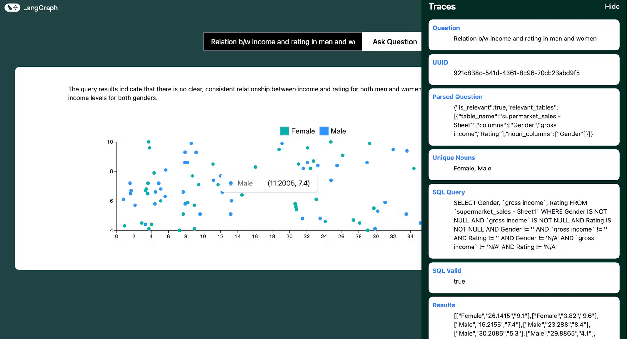
- 我们将用户的问题以及数据库的模式传递给 SQLAgent。使用这些数据,我们提取相关的表和列。
- 我们还识别包含名词的列。我们将在下一步中看到为什么这很重要。
- 如果问题与数据库无关,或者没有足够的信息来回答问题,我们将 is_relevant 设置为 false 并结束工作流程。
提示
You are a data analyst that can help summarize SQL tables and parse user questions about a database.
Given the question and database schema, identify the relevant tables and columns.
If the question is not relevant to the database or if there is not enough information to answer the question, set is_relevant to false.

The "noun_columns" field should contain only the columns that are relevant to the question and contain nouns or names, for example, the column "Artist name" contains nouns relevant to the question "What are the top selling artists?", but the column "Artist ID" is not relevant because it does not contain a noun. Do not include columns that contain numbers.
响应格式
{

"is_relevant": boolean,

"relevant_tables": [

		{{

		"table_name": string,

		"columns": [string],

		"noun_columns": [string]

		}}

	]

}
3. 获取唯一的名词
- 如果用户问“最畅销的艺术家是谁?”或“每个类别的市场份额是多少?”,我们需要知道指的是哪些艺术家或哪些类别,以便生成正确的 SQL 查询。
- 如果用户问“最畅销的 ac dc 歌曲?”(我们都知道它必须是 Thunderstruck),但表格中包含的名称是“AC/DC”而不是“ac dc”怎么办?我们需要获得艺术家姓名的正确拼写,以便生成正确的 SQL 查询。
- 这就是唯一名词的用武之地。我们从问题和模式中提取唯一的名词并将它们匹配。我们可以使用唯一的名词获得艺术家姓名的正确拼写和实体列表。
函数
    def get_unique_nouns(self, state: dict) -> dict:
        """Find unique nouns in relevant tables and columns."""
        parsed_question = state['parsed_question']

        if not parsed_question['is_relevant']:
            return {"unique_nouns": []}

        unique_nouns = set()
        for table_info in parsed_question['relevant_tables']:
            table_name = table_info['table_name']
            noun_columns = table_info['noun_columns']

            if noun_columns:
                column_names = ', '.join(f"`{col}`" for col in noun_columns)
                query = f"SELECT DISTINCT {column_names} FROM `{table_name}`"
                results = self.db_manager.execute_query(state['uuid'], query)
                for row in results:
                    unique_nouns.update(str(value) for value in row if value)

        return {"unique_nouns": list(unique_nouns)}
4. 生成 SQL 查询
我们将模式、用户的问题、解析后的问题和唯一的名词传递给 SQLAgent。我们跳过任何列为 null、“N/A”或“”的行。
提示
You are an AI assistant that generates SQL queries based on user questions, database schema, and unique nouns found in the relevant tables. Generate a valid SQL query to answer the user's question.
If there is not enough information to write a SQL query, respond with "NOT_ENOUGH_INFO".
Here are some examples:
1. What is the top selling product?
Answer: SELECT product_name, SUM(quantity) as total_quantity FROM sales WHERE product_name IS NOT NULL AND quantity IS NOT NULL AND product_name != "" AND quantity != "" AND product_name != "N/A" AND quantity != "N/A" GROUP BY product_name ORDER BY total_quantity DESC LIMIT 1
2. What is the total revenue for each product?
Answer: SELECT product_name, SUM(quantity * price) as total_revenue FROM sales WHERE product_name IS NOT NULL AND quantity IS NOT NULL AND price IS NOT NULL AND product_name != "" AND quantity != "" AND price != "" AND product_name != "N/A" AND quantity != "N/A" AND price != "N/A" GROUP BY product_name ORDER BY total_revenue DESC
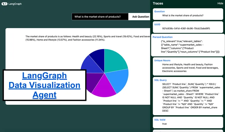
3. What is the market share of each product?
Answer: SELECT product_name, SUM(quantity) * 100.0 / (SELECT SUM(quantity) FROM sales) as market_share FROM sales WHERE product_name IS NOT NULL AND quantity IS NOT NULL AND product_name != "" AND quantity != "" AND product_name != "N/A" AND quantity != "N/A" GROUP BY product_name ORDER BY market_share DESC
4. Plot the distribution of income over time
Answer: SELECT income, COUNT(*) as count FROM users WHERE income IS NOT NULL AND income != "" AND income != "N/A" GROUP BY income
THE RESULTS SHOULD ONLY BE IN THE FOLLOWING FORMAT, SO MAKE SURE TO ONLY GIVE TWO OR THREE COLUMNS:
[[x, y]]
or
[[label, x, y]]
For questions like "plot a distribution of the fares for men and women", count the frequency of each fare and plot it. The x axis should be the fare and the y axis should be the count of people who paid that fare.
SKIP ALL ROWS WHERE ANY COLUMN IS NULL or "N/A" or "".
Just give the query string. Do not format it. Make sure to use the correct spellings of nouns as provided in the unique nouns list.
传递的数据
===Database schema:
{schema}

===User question:

{question}

===Relevant tables and columns:

{parsed_question}

===Unique nouns in relevant tables:

{unique_nouns}
5. 验证和修复 SQL 查询
- 我们将 SQL 查询传递给 SQLAgent。它检查查询是否有效,以及查询中使用的所有表和列是否相关,如果有效,则返回 SQL 查询。
- 例如,在某些情况下,数据需要从字符串转换为日期或整数,这将在这一步中修复。
提示
You are an AI assistant that validates and fixes SQL queries. Your task is to:
1. Check if the SQL query is valid.
2. Ensure all table and column names are correctly spelled and exist in the schema.
3. If there are any issues, fix them and provide the corrected SQL query.
4. If no issues are found, return the original query.

Respond in JSON format with the following structure. Only respond with the JSON:
{{
    "valid": boolean,
    "issues": string or null,
    "corrected_query": string
}}
'''),
            ("human", '''===Database schema:
{schema}

===Generated SQL query:
{sql_query}

Respond in JSON format with the following structure. Only respond with the JSON:
{{
    "valid": boolean,
    "issues": string or null,
    "corrected_query": string
}}

For example:
1. {{
    "valid": true,
    "issues": null,
    "corrected_query": "None"
}}

2. {{
    "valid": false,
    "issues": "Column USERS does not exist",
    "corrected_query": "SELECT * FROM users WHERE age > 25"
}}
6. 执行 SQL 查询
我们将 SQL 查询传递给 DatabaseManager。它将查询传递给远程数据库并返回结果。
7. 选择合适的可视化图表
我认为逆向工程这个过程是个好主意。假设我们正在添加对以下图表/图形的支持
- 柱状图
- 条形图
- 散点图
- 折线图
- 饼图
以下是我们需要支持的问题类型细分
- 条形图/柱状图:
- 问题:“上个季度每种产品的销售额是多少?”,“城市人口如何比较?”,“公司中最常见的 5 个职位头衔是什么?”
- 用例:最适合比较分类数据或显示离散类别随时间的变化。
- 散点图:
- 问题:“广告支出和销售额之间存在关系吗?”,“数据集中身高和体重如何相关?”,“年龄与薪资的分布情况如何?”
- 用例:用于识别两个数值变量之间关系或相关性的理想选择。
- 饼图:
- 问题:“不同公司之间的市场份额分布情况如何?”,“部门预算如何划分?”,“每种产品的总收入百分比是多少?”
- 用例:非常适合显示整体中的比例或百分比。
- 折线图:
- 问题:“网站访问量一年来发生了什么变化?”,“过去十年气温的趋势是什么?”,“股票价格随时间如何波动?”
- 用例:最适合显示连续数据随时间变化的趋势。
这确定了以下提问方向
- 聚合和汇总:
- 示例:“每月的平均收入是多少?”(折线图)
- “显示按产品类别的总销售额。”(条形图/柱状图)
- 比较:
- 示例:“比较去年 A 产品和 B 产品的销售额。”(折线图或柱状图)
- 随时间变化的趋势:
- 示例:“过去一年活跃用户的数量趋势是什么?”(折线图)
- 比例:
- 示例:“每个地区的销售额占比是多少?”(饼图)
- 相关性:
- 示例:“营销支出和收入之间是否存在相关性?”(散点图)
提示
You are an AI assistant that recommends appropriate data visualizations. Based on the user's question, SQL query, and query results, suggest the most suitable type of graph or chart to visualize the data. If no visualization is appropriate, indicate that.

Available chart types and their use cases:

- Bar Graphs: Best for comparing categorical data or showing changes over time when categories are discrete and the number of categories is more than 2. Use for questions like "What are the sales figures for each product?" or "How does the population of cities compare? or "What percentage of each city is male?"
- Horizontal Bar Graphs: Best for comparing categorical data or showing changes over time when the number of categories is small or the disparity between categories is large. Use for questions like "Show the revenue of A and B?" or "How does the population of 2 cities compare?" or "How many men and women got promoted?" or "What percentage of men and what percentage of women got promoted?" when the disparity between categories is large.
- Scatter Plots: Useful for identifying relationships or correlations between two numerical variables or plotting distributions of data. Best used when both x axis and y axis are continuous. Use for questions like "Plot a distribution of the fares (where the x axis is the fare and the y axis is the count of people who paid that fare)" or "Is there a relationship between advertising spend and sales?" or "How do height and weight correlate in the dataset? Do not use it for questions that do not have a continuous x axis."
- Pie Charts: Ideal for showing proportions or percentages within a whole. Use for questions like "What is the market share distribution among different companies?" or "What percentage of the total revenue comes from each product?"
- Line Graphs: Best for showing trends and distributionsover time. Best used when both x axis and y axis are continuous. Used for questions like "How have website visits changed over the year?" or "What is the trend in temperature over the past decade?". Do not use it for questions that do not have a continuous x axis or a time based x axis.

Consider these types of questions when recommending a visualization:

1. Aggregations and Summarizations (e.g., "What is the average revenue by month?" - Line Graph)

2. Comparisons (e.g., "Compare the sales figures of Product A and Product B over the last year." - Line or Column Graph)

3. Plotting Distributions (e.g., "Plot a distribution of the age of users" - Scatter Plot)

4. Trends Over Time (e.g., "What is the trend in the number of active users over the past year?" - Line Graph)

5. Proportions (e.g., "What is the market share of the products?" - Pie Chart)

6. Correlations (e.g., "Is there a correlation between marketing spend and revenue?" - Scatter Plot)

Provide your response in the following format:

Recommended Visualization: [Chart type or "None"]. ONLY use the following names: bar, horizontal_bar, line, pie, scatter, none

Reason: [Brief explanation for your recommendation]
8. 格式化数据以进行可视化
我们将 SQL 查询结果传递给 DataFormatter。它根据可视化类型格式化数据。如果结果采用可预测的格式,我们已经实现了基于规则的逻辑来格式化数据,并且仅使用 LLM 来生成标签,这加快了流程,尤其是在条形图、折线图和散点图的情况下。否则,我们将结果传递给 LLM 以格式化数据。
格式化说明
barGraphIntstruction = '''

  Where data is: {
    labels: string[]
    values: {\\data: number[], label: string}[]
  }

// Examples of usage:
Each label represents a column on the x axis.
Each array in values represents a different entity.

Here we are looking at average income for each month.
1. data = {
  labels: ['Jan', 'Feb', 'Mar', 'Apr', 'May', 'Jun'],
  values: [{data:[21.5, 25.0, 47.5, 64.8, 105.5, 133.2], label: 'Income'}],
}

Here we are looking at the performance of american and european players for each series. Since there are two entities, we have two arrays in values.
2. data = {
  labels: ['series A', 'series B', 'series C'],
  values: [{data:[10, 15, 20], label: 'American'}, {data:[20, 25, 30], label: 'European'}],
}
'''

horizontalBarGraphIntstruction = '''

  Where data is: {
    labels: string[]
    values: {\\data: number[], label: string}[]
  }

// Examples of usage:
Each label represents a column on the x axis.
Each array in values represents a different entity.

Here we are looking at average income for each month.
1. data = {
  labels: ['Jan', 'Feb', 'Mar', 'Apr', 'May', 'Jun'],
  values: [{data:[21.5, 25.0, 47.5, 64.8, 105.5, 133.2], label: 'Income'}],
}

Here we are looking at the performance of american and european players for each series. Since there are two entities, we have two arrays in values.
2. data = {
  labels: ['series A', 'series B', 'series C'],
  values: [{data:[10, 15, 20], label: 'American'}, {data:[20, 25, 30], label: 'European'}],
}

'''

lineGraphIntstruction = '''

  Where data is: {
  xValues: number[] | string[]
  yValues: { data: number[]; label: string }[]
}

// Examples of usage:

Here we are looking at the momentum of a body as a function of mass.
1. data = {
  xValues: ['2020', '2021', '2022', '2023', '2024'],
  yValues: [
    { data: [2, 5.5, 2, 8.5, 1.5]},
  ],
}

Here we are looking at the performance of american and european players for each year. Since there are two entities, we have two arrays in yValues.
2. data = {
  xValues: ['2020', '2021', '2022', '2023', '2024'],
  yValues: [
    { data: [2, 5.5, 2, 8.5, 1.5], label: 'American' },
    { data: [2, 5.5, 2, 8.5, 1.5], label: 'European' },
  ],
}
'''

pieChartIntstruction = '''

  Where data is: {
    labels: string
    values: number
  }[]

// Example usage:
 data = [
        { id: 0, value: 10, label: 'series A' },
        { id: 1, value: 15, label: 'series B' },
        { id: 2, value: 20, label: 'series C' },
      ],
'''

scatterPlotIntstruction = '''
Where data is: {
  series: {
    data: { x: number; y: number; id: number }[]
    label: string
  }[]
}

// Examples of usage:
1. Here each data array represents the points for a different entity.
We are looking for correlation between amount spent and quantity bought for men and women.
data = {
  series: [
    {
      data: [
        { x: 100, y: 200, id: 1 },
        { x: 120, y: 100, id: 2 },
        { x: 170, y: 300, id: 3 },
      ],
      label: 'Men',
    },
    {
      data: [
        { x: 300, y: 300, id: 1 },
        { x: 400, y: 500, id: 2 },
        { x: 200, y: 700, id: 3 },
      ],
      label: 'Women',
    }
  ],
}

2. Here we are looking for correlation between the height and weight of players.
data = {
  series: [
    {
      data: [
        { x: 180, y: 80, id: 1 },
        { x: 170, y: 70, id: 2 },
        { x: 160, y: 60, id: 3 },
      ],
      label: 'Players',
    },
  ],
}

// Note: Each object in the 'data' array represents a point on the scatter plot.
// The 'x' and 'y' values determine the position of the point, and 'id' is a unique identifier.
// Multiple series can be represented, each as an object in the outer array.
'''

graph_instructions = {
    "bar": barGraphIntstruction,
    "horizontal_bar": horizontalBarGraphIntstruction,
    "line": lineGraphIntstruction,
    "pie": pieChartIntstruction,
    "scatter": scatterPlotIntstruction
}
数据格式化器
class DataFormatter:
    def __init__(self):
        self.llm_manager = LLMManager()


    def format_data_for_visualization(self, state: dict) -> dict:
        """Format the data for the chosen visualization type."""
        visualization = state['visualization']
        results = state['results']
        question = state['question']
        sql_query = state['sql_query']

        if visualization == "none":
            return {"formatted_data_for_visualization": None}

        if visualization == "scatter":
            try:
                return self._format_scatter_data(results)
            except Exception as e:
                return self._format_other_visualizations(visualization, question, sql_query, results)

        if visualization == "bar" or visualization == "horizontal_bar":
            try:
                return self._format_bar_data(results, question)
            except Exception as e:
                return self._format_other_visualizations(visualization, question, sql_query, results)

        if visualization == "line":
            try:
                return self._format_line_data(results, question)
            except Exception as e:
                return self._format_other_visualizations(visualization, question, sql_query, results)

        return self._format_other_visualizations(visualization, question, sql_query, results)

    def _format_line_data(self, results, question):
        if isinstance(results, str):
            results = eval(results)

        if len(results[0]) == 2:

            x_values = [str(row[0]) for row in results]
            y_values = [float(row[1]) for row in results]

            # Use LLM to get a relevant label
            prompt = ChatPromptTemplate.from_messages([
                ("system", "You are a data labeling expert. Given a question and some data, provide a concise and relevant label for the data series."),
                ("human", "Question: {question}\\n Data (first few rows): {data}\\n\\nProvide a concise label for this y axis. For example, if the data is the sales figures over time, the label could be 'Sales'. If the data is the population growth, the label could be 'Population'. If the data is the revenue trend, the label could be 'Revenue'."),
            ])
            label = self.llm_manager.invoke(prompt, question=question, data=str(results[:2]))

            formatted_data = {
                "xValues": x_values,
                "yValues": [
                    {
                        "data": y_values,
                        "label": label.strip()
                    }
                ]
            }
        elif len(results[0]) == 3:

            # Group data by label
            data_by_label = {}
            x_values = []

            for item1, item2, item3 in results:
                # Determine which item is the label (string not convertible to float and not containing "/")
                if isinstance(item1, str) and not item1.replace(".", "").isdigit() and "/" not in item1:
                    label, x, y = item1, item2, item3
                else:
                    x, label, y = item1, item2, item3


                if str(x) not in x_values:
                    x_values.append(str(x))
                if label not in data_by_label:
                    data_by_label[label] = []
                data_by_label[label].append(float(y))

            # Create yValues array
            y_values = [
                {
                    "data": data,
                    "label": label
                }
                for label, data in data_by_label.items()
            ]

            formatted_data = {
                "xValues": x_values,
                "yValues": y_values
            }

            # Use LLM to get a relevant label for the y-axis
            prompt = ChatPromptTemplate.from_messages([
                ("system", "You are a data labeling expert. Given a question and some data, provide a concise and relevant label for the y-axis."),
                ("human", "Question: {question}\\n Data (first few rows): {data}\\n\\nProvide a concise label for the y-axis. For example, if the data represents sales figures over time for different categories, the label could be 'Sales'. If it's about population growth for different groups, it could be 'Population'."),
            ])
            y_axis_label = self.llm_manager.invoke(prompt, question=question, data=str(results[:2]))

            # Add the y-axis label to the formatted data
            formatted_data["yAxisLabel"] = y_axis_label.strip()

        return {"formatted_data_for_visualization": formatted_data}

    def _format_scatter_data(self, results):
        if isinstance(results, str):
            results = eval(results)

        formatted_data = {"series": []}

        if len(results[0]) == 2:
            formatted_data["series"].append({
                "data": [
                    {"x": float(x), "y": float(y), "id": i+1}
                    for i, (x, y) in enumerate(results)
                ],
                "label": "Data Points"
            })
        elif len(results[0]) == 3:
            entities = {}
            for item1, item2, item3 in results:
                # Determine which item is the label (string not convertible to float and not containing "/")
                if isinstance(item1, str) and not item1.replace(".", "").isdigit() and "/" not in item1:
                    label, x, y = item1, item2, item3
                else:
                    x, label, y = item1, item2, item3
                if label not in entities:
                    entities[label] = []
                entities[label].append({"x": float(x), "y": float(y), "id": len(entities[label])+1})

            for label, data in entities.items():
                formatted_data["series"].append({
                    "data": data,
                    "label": label
                })
        else:
            raise ValueError("Unexpected data format in results")

        return {"formatted_data_for_visualization": formatted_data}

    def _format_bar_data(self, results, question):
        if isinstance(results, str):
            results = eval(results)

        if len(results[0]) == 2:
            # Simple bar chart with one series
            labels = [str(row[0]) for row in results]
            data = [float(row[1]) for row in results]

            # Use LLM to get a relevant label
            prompt = ChatPromptTemplate.from_messages([
                ("system", "You are a data labeling expert. Given a question and some data, provide a concise and relevant label for the data series."),
                ("human", "Question: {question}\\nData (first few rows): {data}\\n\\nProvide a concise label for this y axis. For example, if the data is the sales figures for products, the label could be 'Sales'. If the data is the population of cities, the label could be 'Population'. If the data is the revenue by region, the label could be 'Revenue'."),
            ])
            label = self.llm_manager.invoke(prompt, question=question, data=str(results[:2]))

            values = [{"data": data, "label": label}]
        elif len(results[0]) == 3:
            # Grouped bar chart with multiple series
            categories = set(row[1] for row in results)
            labels = list(categories)
            entities = set(row[0] for row in results)
            values = []
            for entity in entities:
                entity_data = [float(row[2]) for row in results if row[0] == entity]
                values.append({"data": entity_data, "label": str(entity)})
        else:
            raise ValueError("Unexpected data format in results")

        formatted_data = {
            "labels": labels,
            "values": values
        }

        return {"formatted_data_for_visualization": formatted_data}

    def _format_other_visualizations(self, visualization, question, sql_query, results):
        instructions = graph_instructions[visualization]
        prompt = ChatPromptTemplate.from_messages([
            ("system", "You are a Data expert who formats data according to the required needs. You are given the question asked by the user, it's sql query, the result of the query and the format you need to format it in."),
            ("human", 'For the given question: {question}\\n\\nSQL query: {sql_query}\\n\\Result: {results}\\n\\nUse the following example to structure the data: {instructions}. Just give the json string. Do not format it'),
        ])
        response = self.llm_manager.invoke(prompt, question=question, sql_query=sql_query, results=results, instructions=instructions)

        try:
            formatted_data_for_visualization = json.loads(response)
            return {"formatted_data_for_visualization": formatted_data_for_visualization}
        except json.JSONDecodeError:
            return {"error": "Failed to format data for visualization", "raw_response": response}
在整个工作流程中,这是我们的状态
class State(TypedDict):
    question: str
    uuid: str
    parsed_question: Dict[str, Any]
    unique_nouns: List[str]
    sql_query: str
    sql_valid: bool
    sql_issues: str
    results: List[Any]
    answer: Annotated[str, operator.add]
    error: str
    visualization: Annotated[str, operator.add]
    visualization_reason: Annotated[str, operator.add]
    formatted_data_for_visualization: Dict[str, Any]
前端
在前端,我们有预构建的图表模板,用于显示可视化效果。
我们使用 langgraph 的流式 api 来实时获取工作流程的状态和更新,以提供一个友好的 UI,用户可以在其中看到工作流程的进度。
可视化生成后,用户可以查看工作流程的追踪以及最终的可视化效果。
结论
通过结合 LangGraph Cloud 的流式 API、并行处理能力和交互式工作室的强大功能,我们创建了一个灵活而强大的数据可视化 Agent。这个项目演示了如何利用现代 AI 工具来创建用于数据库查询和数据可视化的直观界面。
能够用自然语言提问关于您数据的问题,并获得即时、视觉上吸引人的结果,为数据探索和分析开辟了新的可能性。无论您是数据科学家、业务分析师,还是只是对您的数据感到好奇的人,此工具都提供了一种可访问且强大的方式来获得见解。
我们鼓励您试用这个项目,将其连接到您自己的数据库,并探索 LangGraph Cloud 的 Agent 工作流程的可能性!